Human Rights Watch
Rebranding for Human Rights Watch, a non-profit organization that partners with other global organizations to investigate and report abuse on human rights occurring all around the world.
Their advocacy is directed towards governments, armed forces and businesses to get them to change and fix our laws, policies and practices and ultimately bring justice to where it is needed all while refusing any government funding and corporate ties.
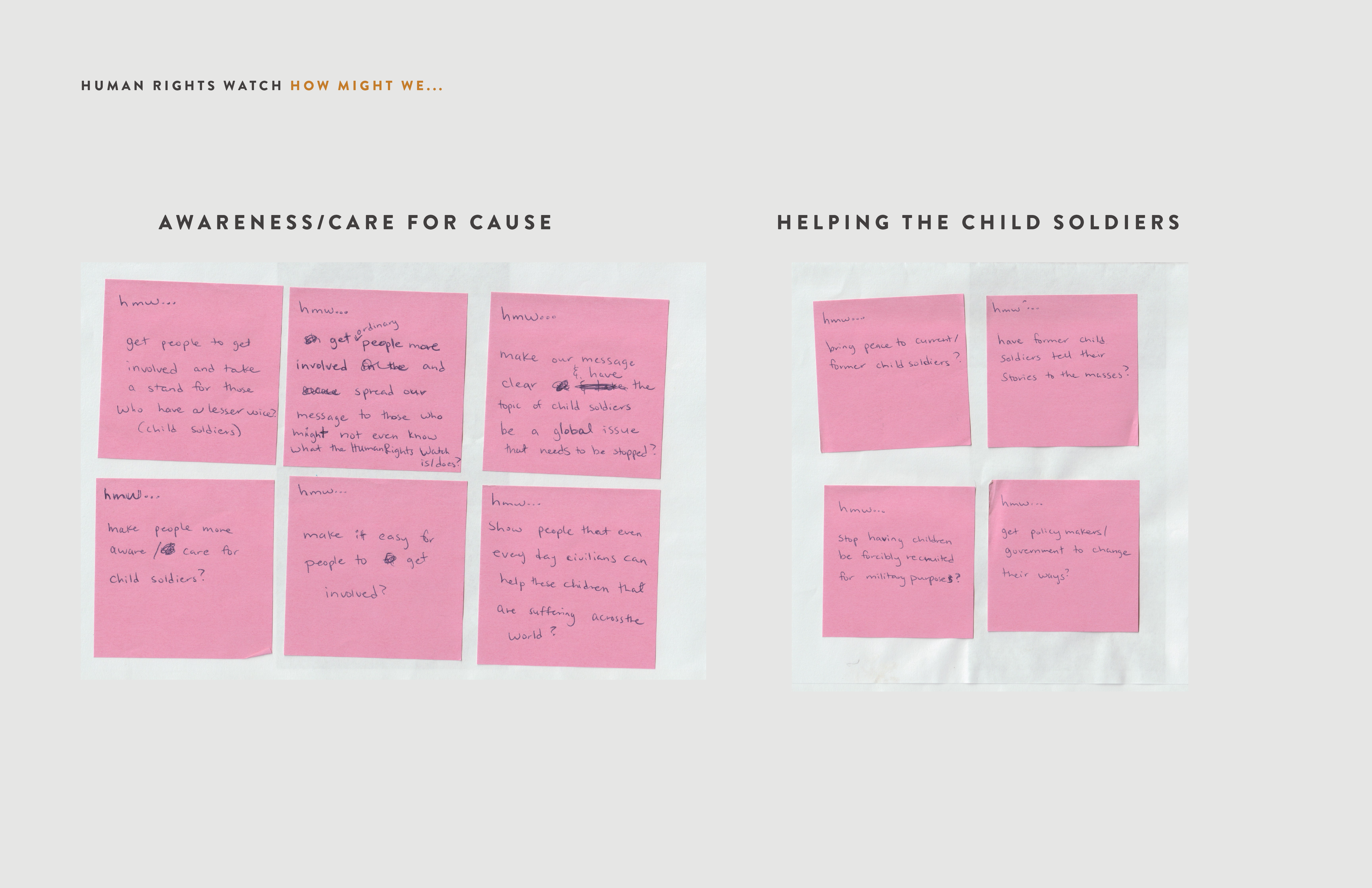
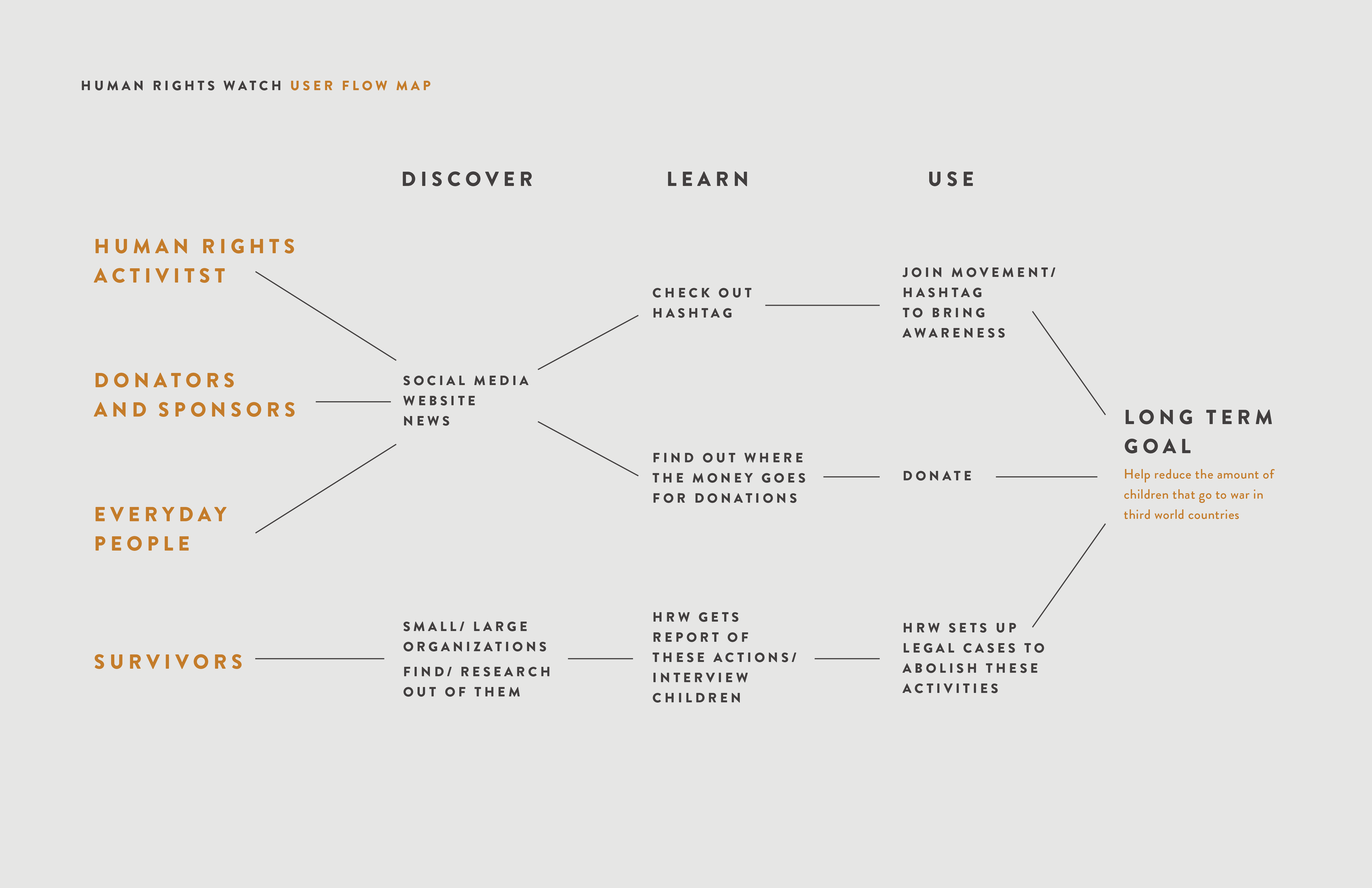
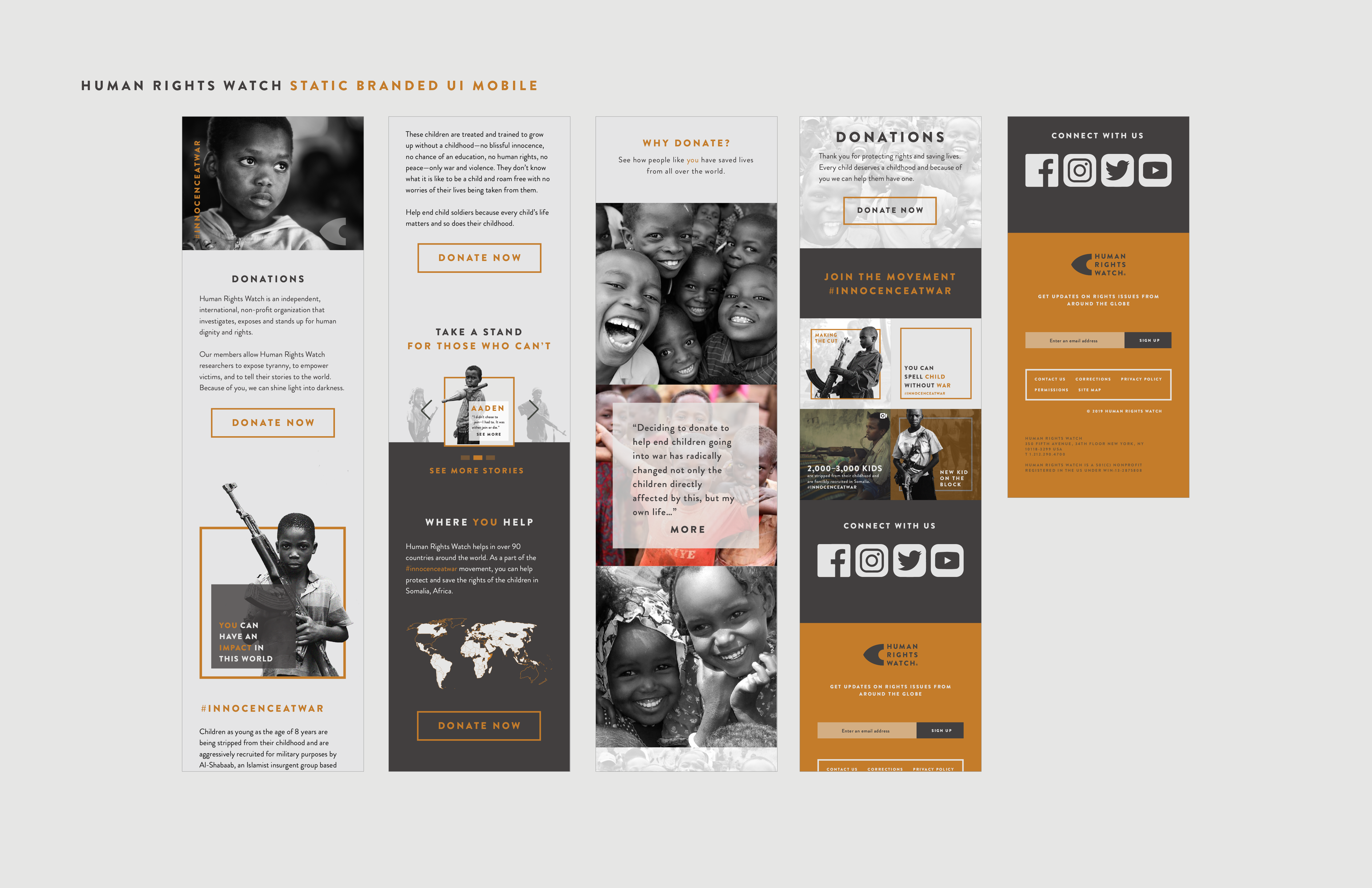
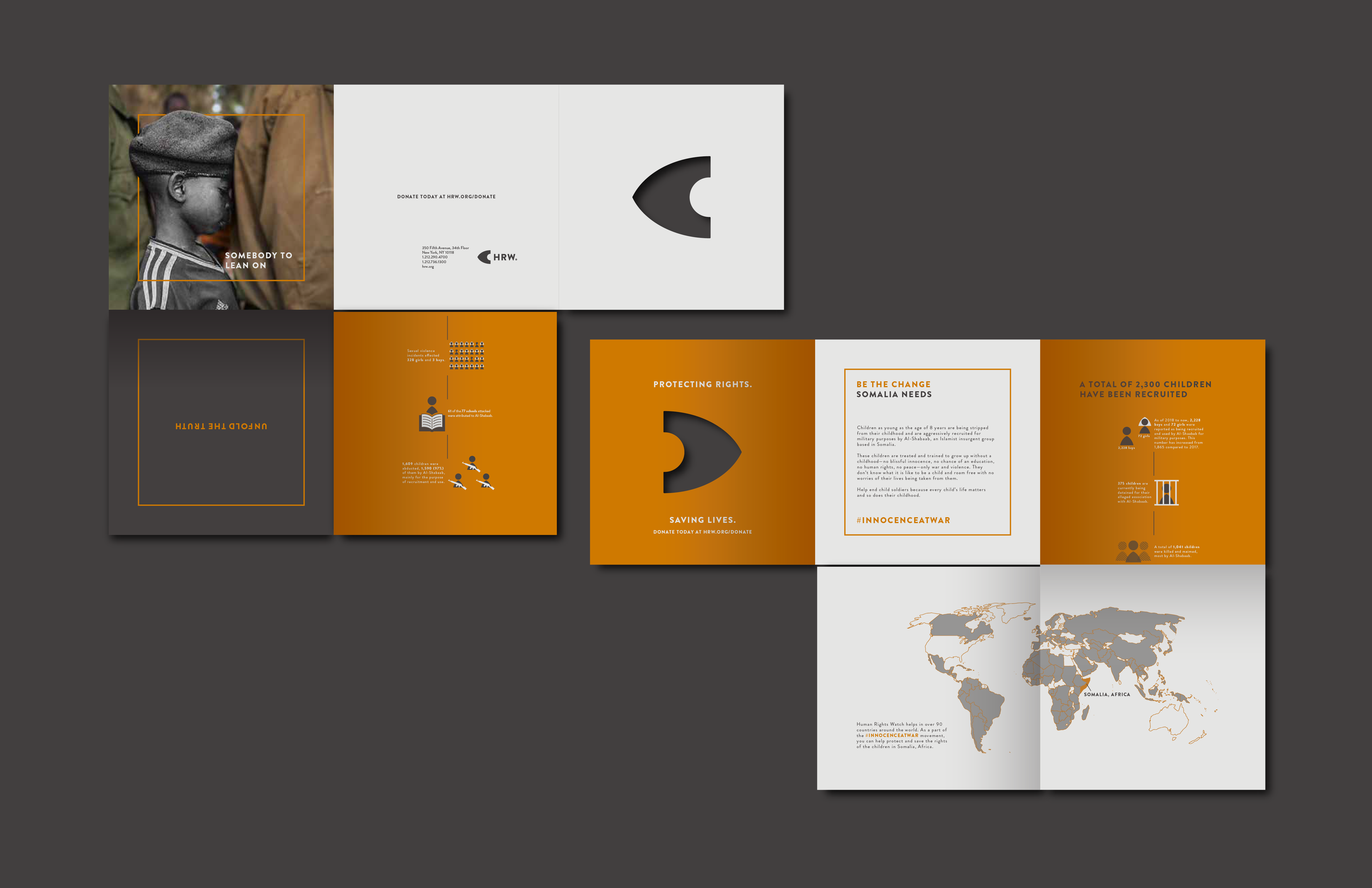
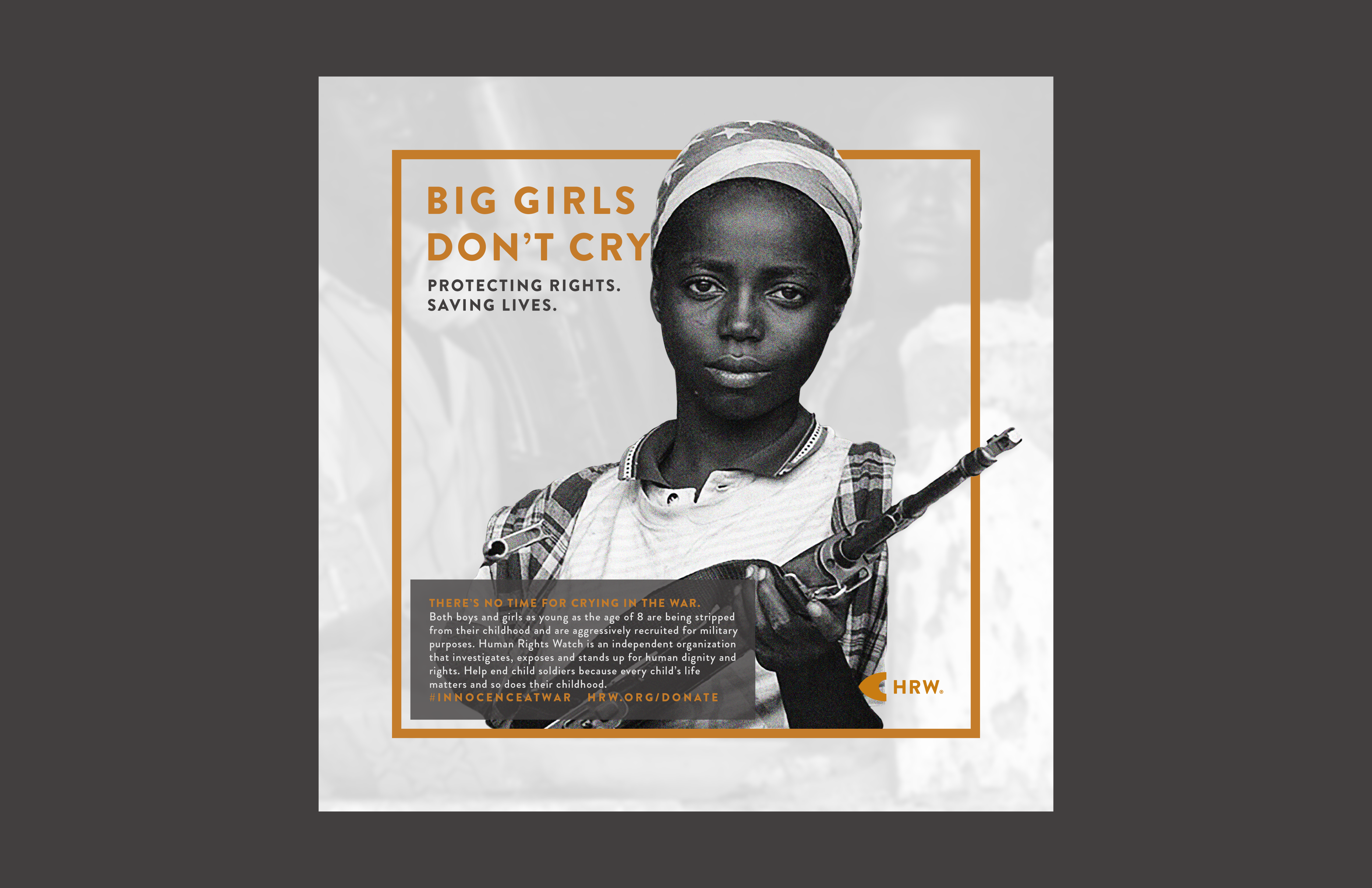
The target of the rebrand is to enhance a brand voice that speaks for the brand—positively impactful, truthful and trustworthy, as well as staying professional and informative. The main focus of this particular campaign is to give a voice to those who don’t have one and help put an end to children being recruited for war in Somalia, Africa by creating a responsive user-friendly web design landing page.
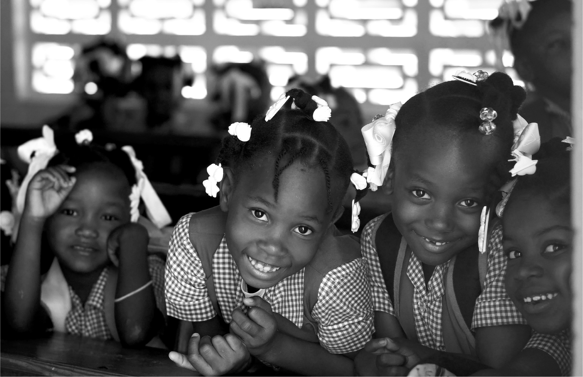
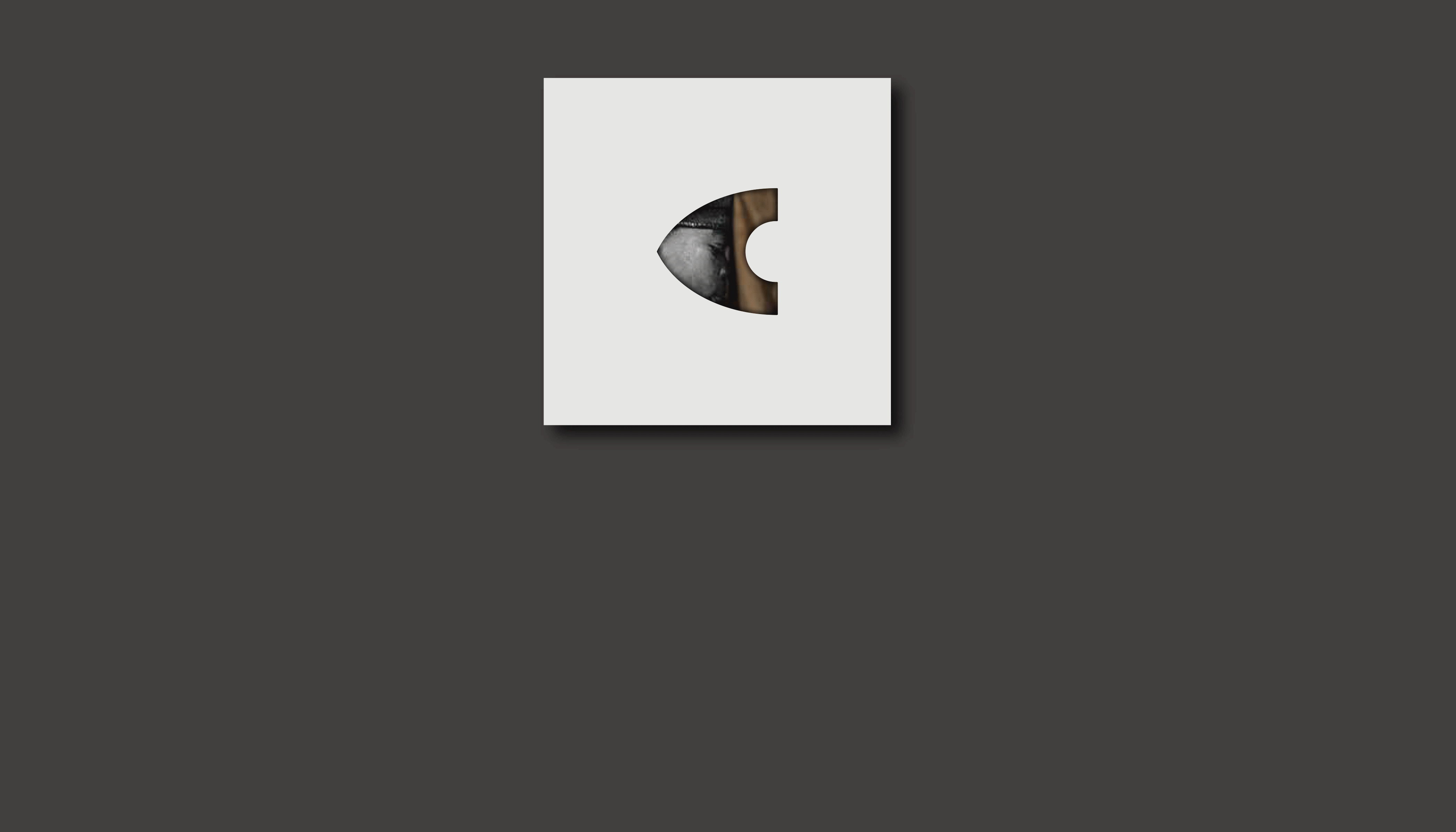
The brandmark is embosssed or die-cutted onto paper touchpoints like the brochure to amplify the brand’s message of “watch”. The brand’s colors are neutral greys to show the seriousness of the causes that the brand is standing up for. The subtle use of orange enhances feelings of energy, hope and a call to action. The grayscale photography unifies the brand voice with the colors chosen for the brand.
Photo Courtesy: Issouf Sanogo AFP, Colin Mearns, Reuters Jacky Naegelen, Unicef Mony, Unicef Benin
Their advocacy is directed towards governments, armed forces and businesses to get them to change and fix our laws, policies and practices and ultimately bring justice to where it is needed all while refusing any government funding and corporate ties.
The target of the rebrand is to enhance a brand voice that speaks for the brand—positively impactful, truthful and trustworthy, as well as staying professional and informative. The main focus of this particular campaign is to give a voice to those who don’t have one and help put an end to children being recruited for war in Somalia, Africa by creating a responsive user-friendly web design landing page.
The brandmark is embosssed or die-cutted onto paper touchpoints like the brochure to amplify the brand’s message of “watch”. The brand’s colors are neutral greys to show the seriousness of the causes that the brand is standing up for. The subtle use of orange enhances feelings of energy, hope and a call to action. The grayscale photography unifies the brand voice with the colors chosen for the brand.
Photo Courtesy: Issouf Sanogo AFP, Colin Mearns, Reuters Jacky Naegelen, Unicef Mony, Unicef Benin